I like OmniGraffle on iPhone and iPad because a diagram should not become inaccessible the moment I leave a Mac. I enjoyed the product. Its strongest appeal is giving a real editable document a place on another device, with an interface designed around touch rather than a picture that can only be viewed.
Quick verdict
I recommend OmniGraffle 3 Pro for keeping editable diagrams useful away from the Mac.
- Best for
- iPad users who want to revise structured diagrams with touch.
- Main benefit
- I like having a real editable diagram rather than a picture that can only be viewed.
- Biggest drawback
- A phone screen is a tighter space for detailed editing than an iPad or Mac.
OmniGraffle 3 Pro
The Omni Group · Choose the local store or delivery region
Check price and availability: OmniGraffle 3 Pro at The Omni GroupProduct link.
Reviewed version: OmniGraffle 3 Pro
Compatibility: OmniGraffle 3 Pro for supported iPhone and iPad models and software. The Mac edition is a separate product and purchase arrangement.
Review context: The review focuses on iPad users who want to revise structured diagrams with touch.
The Omni Group provided the Pro licence free of charge for this review. Product screenshots in this article come from the Omni Group.
This is OmniGraffle 3 Pro for iPhone and iPad. The product page lists it separately from the Mac 7 line. Keeping that distinction clear matters when comparing licences, features, and documents. A common product family can still have different interfaces and platform choices.
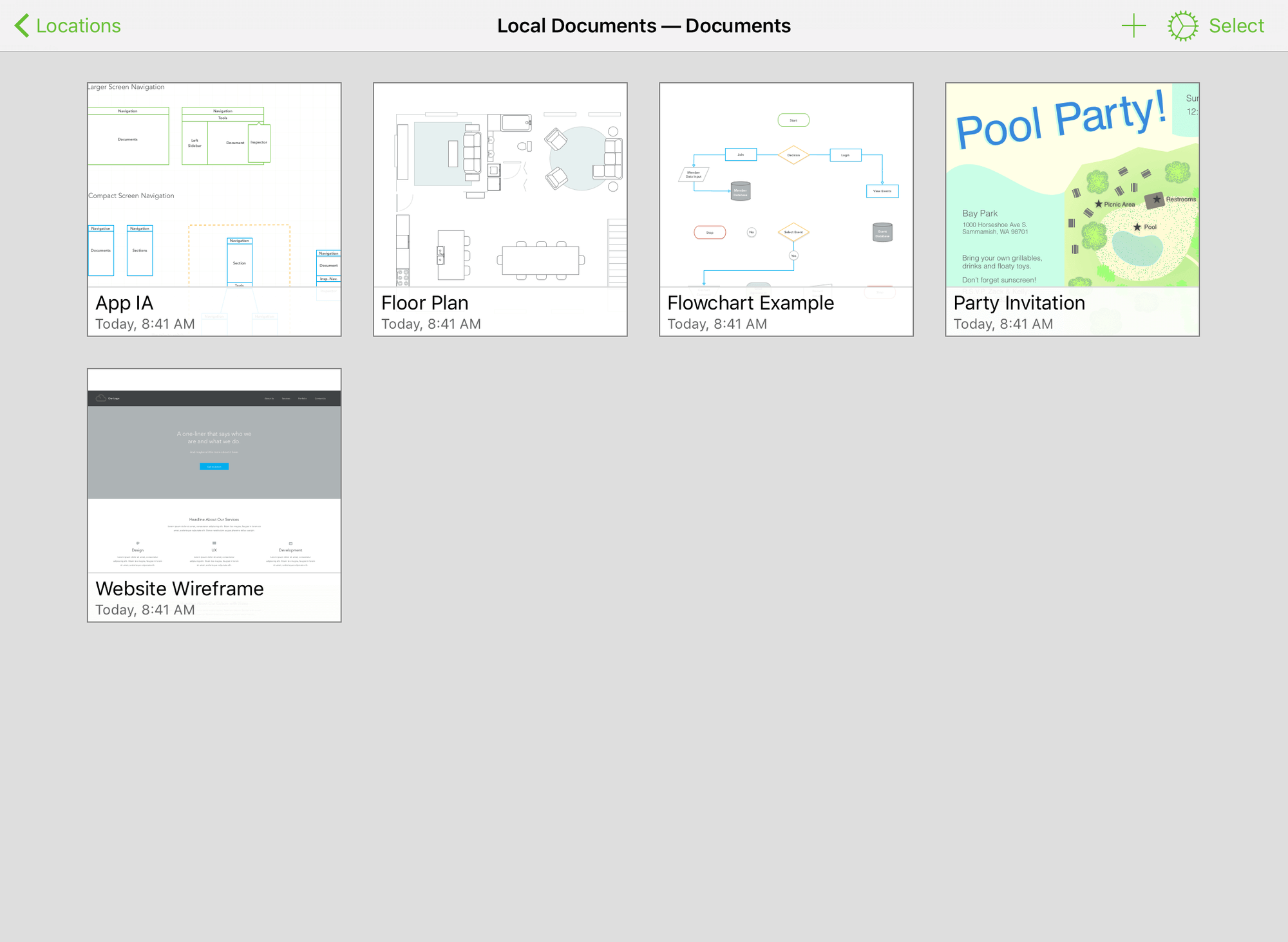
The iPad is the natural canvas
A diagram benefits from visible space. Shapes need room to show their relationships, and the reader needs enough context to understand which part of the system is in view. That makes an iPad an appealing setting for this kind of work.
I like the directness of a touch canvas. I can choose and arrange the object that represents an idea, rather than managing a collection of windows around it. The interface still needs exact tools, but it should leave the diagram at the centre of attention.
There is a balance between direct manipulation and exact adjustment. Dragging is useful for establishing a layout. Inspectors are useful when size, position, or style needs a careful value. A good mobile graphics application provides both routes without pretending they are the same task.
Related reading
This is one of the reasons I enjoyed OmniGraffle’s direction. It is a serious document tool on a device often associated with lighter work. The attraction is not claiming that every diagram should move away from the desk. It is having a meaningful choice when a different setting suits the conversation or the stage of the work.
A phone has a different role
An iPhone has much less room for a broad canvas. That changes the useful questions. It can be a place to inspect a document, check a label, or make a focused adjustment. It is a less natural place to judge the overall balance of a large diagram.
I prefer that distinction to expecting identical comfort on every screen. A common file should remain useful while the device’s role changes. The larger document can be planned elsewhere, while a smaller screen provides access when the relevant question is narrow.
The interface needs to protect that focus. A toolbar that consumes too much space can make the diagram feel like a thumbnail. A control that moves away when it is no longer needed can leave more room for the work. These are practical details that matter more on a phone than on a large desktop display.
I like having the phone option, but it would not be my main reason to buy the product. The stronger case is an iPad workflow with useful access on the phone as part of the same family of documents.
The floating palette makes sense for touch
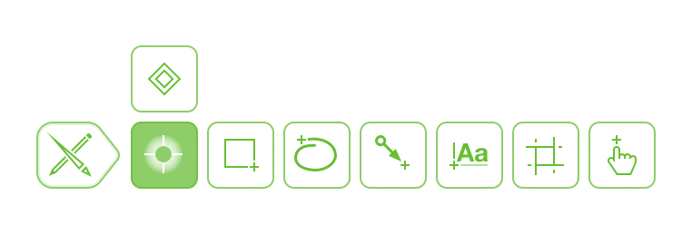
The official tool palette guide describes a movable, collapsible palette and different tool states. That is a good way to keep drawing controls available while allowing the canvas to remain the main surface.
I like an interface that distinguishes choosing a tool for one action from continuing to use it. Drawing a group of related shapes and then returning to selection is a different rhythm from making one small adjustment. The controls should support both without making the user repeatedly hunt for the same command.
There is a learning step. Touch graphics applications need clear selection rules, because a finger does not communicate intent as precisely as a pointer. The user needs to know whether the next action will move an object, edit text, or create something new.
That learning feels worthwhile when the result is a predictable workspace. The useful measure is whether the interface becomes easier to reason about as the document grows. A small collection of clear modes can be more comfortable than trying to make every gesture do several jobs.
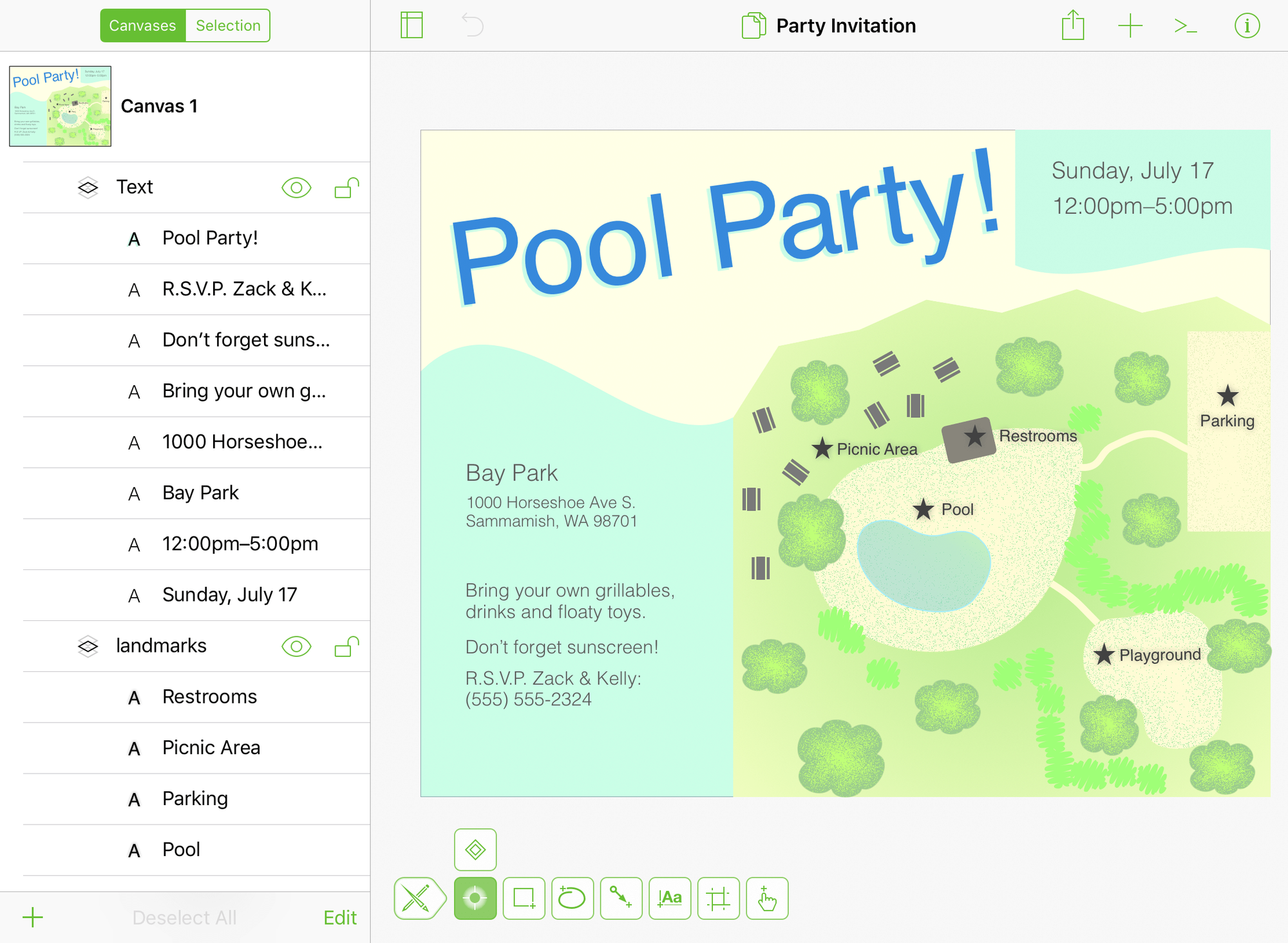
Structure matters on a touch document
A diagram can look simple while containing many objects. Background frames, labels, connectors, and annotations may all overlap. Without organisation, selecting the intended piece becomes harder as the document develops.
The navigation sidebar manual describes canvases, layers, and objects as another way into the document. I value that because visual selection should not be the only route to an item. A structural view can make a crowded canvas easier to maintain.
Related reading

The document’s own names matter here. A layer called “notes” explains a role. A pile of unnamed objects offers less help. The tool gives the structure a place, while the author needs to keep it readable for the next person who opens the file.
This is also why I like separating a diagram’s purpose into distinct canvases when necessary. A system overview and a detailed flow can share a document without fighting for the same page. The reader gets a clearer question in each view, and the editor gets a more manageable working area.
The diagram still needs a visual language
Touch input does not change the communication problem. A box needs a consistent meaning. A connector needs a clear relationship. A colour should either help the reader or be simple enough to stay out of the way.
I would start with a small set of shared rules and keep them consistent across devices. If a service uses one shape on the Mac, it should remain recognisable on the iPad. The reader should not need to learn a new visual vocabulary because the document was edited on another screen.
The OmniGraffle feature overview describes shared document concepts and platform specific tools. The practical attraction is a link between parts of the work. A diagram can remain one explanation while its editing environment changes.
I enjoy that connection, especially for a document that may be discussed, adjusted, and shared more than once. The application is useful when it supports the explanation without making device management the main task. The file should feel like the durable part; the screen is where it happens to be open.
Export should suit the reader
A diagram often leaves the application as an image or another document format. The mobile opening and export guide explains that part of the workflow. I like treating export as a real stage of the job, rather than simply the last button to press.
The output needs to match its destination. A diagram intended for a phone screen should not rely on tiny labels across a huge landscape canvas. A diagram in a report needs a clear boundary and enough contrast to survive its final size. The source document can be excellent while the shared image is difficult to read.
I also want to preserve the editable source. A screenshot is convenient for a discussion, but it is a poor starting point for the next revision. Keeping the document available makes later changes less likely to become an exercise in rebuilding the diagram by eye.
That is a practical reason to value a real mobile document tool. It can participate in the source workflow rather than only display a final picture. The benefit is strongest when the document will continue to change and several devices have a useful role in that process.
Why I enjoyed it
I like software that lets a device do meaningful work without requiring it to imitate another device completely. The iPad can be a good place for a visual document, while the iPhone can provide a narrower form of access. Those roles are useful in their own right.
OmniGraffle appeals to me because it keeps the document’s structure available. The result can contain canvases, layers, and objects that remain editable, rather than a flattened sketch that has reached the end of its life. That makes the product interesting for more than a quick drawing.
Related reading

There is a cost in learning selection, tools, inspectors, and the organisation of the file. I would expect that investment to make sense for regular diagram work. Someone who only needs occasional informal sketches may prefer a simpler application.
Keep the next edit in mind
I like the mobile app most when I think about the next revision as well as the current picture. A clear layer name or a good grouping may not change the exported image, but it can make the next adjustment much easier. That matters when a document moves between devices or between people.
I want to keep the work connected across devices. The iPad should not become a place where an editable document turns into a collection of disconnected copies. I want to know which file carries the current explanation and preserve its structure for the next person. OmniGraffle’s document approach appeals to me because that remains a realistic part of the workflow away from a Mac.
My verdict
I enjoyed OmniGraffle 3 Pro and like the seriousness of its approach to diagrams on iPhone and iPad. The iPad is the stronger reason to consider it, with the phone adding useful access for smaller questions. Its value is an editable diagram that can move with the work.
Check the current OmniGraffle purchase options for the exact platform and edition. My positive view comes from the way the app respects both the diagram and the device. It gives a visual explanation a useful life away from the desk while preserving the structure needed to improve it later.
Where to buy
See OmniGraffle 3 Pro at the official product page. This is the product page for the model covered in this review. Check the model number, colour, included parts and delivery options before ordering. Prices and stock can change, so I use this page for the current offer. Matching the product to the review matters more to me than finding a similar name.
What worked
- I like having a real editable diagram rather than a picture that can only be viewed.
- Layers, grouping and the document structure matter for the next revision as well as the current export.
What bothered me
- A phone screen is a tighter space for detailed editing than an iPad or Mac.
- The Mac 7 line and iPhone/iPad 3 line are separate products; a familiar name does not define licence coverage.
Who should not buy it
- Someone who only needs to look at occasional exported diagrams.
Alternatives I would consider
- OmniGraffle 7 Pro for Mac. I would choose the Mac version for a desk-based diagram workflow and this version when touch editing on iPad is the point. Read my OmniGraffle 7 Pro for Mac review.
Evidence and sources
The article separates my judgement from specifications and claims credited to their sources. Product images are identified by the credits in the article.
Features, compatibility and rated figures from the maker are manufacturer information. My opinions are identified in the review.
Conclusion
Worth it when editing on an iPad is part of the job; check the separate platform and edition terms.
OmniGraffle 3 Pro
The Omni Group · Choose the local store or delivery region
Check price and availability: OmniGraffle 3 Pro at The Omni GroupProduct link.
One email a week with practical Mac workflows, useful comparisons and honest tech recommendations.